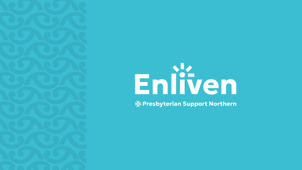
Enliven has refreshed its brand logo and colour to give us a more modern and contemporary look.
The change has been rolled out across our website and overtime will be introduced to our social media channels, brochures and other collaterals.
After conducting research and seeking feedback from a range of stakeholders, we’ve worked with an external brand agency to come up with the new look. The research indicated that our brand should be more modern, look more unified and reflect our value of tangata whenua more.
Enliven not only has a new fresher colour, but a new symbol representing a person’s life force or mauri. It is designed to show energy and a feeling of positivity.
Added to this is a Koiri kōwhaiwhai, a pattern which represents flourishing, reflection and nurturing.
Our sister brands under the parent Presbyterian Support Northern brand have also been refreshed with a new look and feel, as well as new graphical elements and symbols. Some of these can be seen at the bottom of the website page.